Arts & Entertainment
Photo Friday: Color vs. black and white
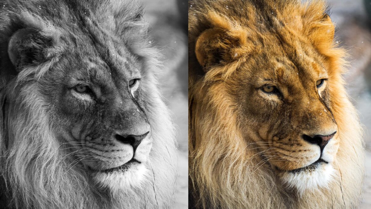
Photos of a male lion at Utah's Hogle Zoo in black and white on the left and color on the right. Photo: TownLift // Kevin Cody.
PARK CITY, Utah — While not the conversation it once was during the film days, the choice between black and white and color is still one that photographers, artists, and filmmakers still make today.
For many years it was locked in a move to insert a black and white film or a color film into the camera for the 36 exposures. In the digital world, it’s now an after-the-fact choice that only takes the click of a mouse or the press of a finger. There are many reasons to choose one or the other, but what isn’t up for debate is that they are diametrically opposing forces that change how a viewer interprets an image.
Color is about emotion and feeling, even if the viewer doesn’t realize it. Each color has its own meaning and produces a different reaction from the viewer if a photographer is trying to create tension or show an important scene, then having a bright blue sky or a landscape of green grass and colorful flowers depicting the excitement of Springtime.
The actual meaning of colors is a moving target as the previously mentioned bright blue sky or seemingly perfect springtime landscape could just as easily convey a negative view with some added context, such that it could paint a picture in the viewer’s mind of the subject trying to cover up underlying darkness or negative feelings or maybe the flaws of something supposedly “perfect.”
Aside from emotion, color has other effects on an image, such as potentially distracting the viewer’s eyes and overcomplicating a scene. Putting aside the topic of forming compositions in photography that would also affect where the viewer is looking, the takeaway point is that black and white takes a scene and simplifies it into lines and textures while also bringing attention to shadows and highlights. At the same time, color adds depth through feeling and makes the subject feel alive.

In the case of the two images of a male lion pictured here, both images received the same edits, but one photo is in color and the other black and white. The color image contains several shades of orange or red depending on what part of the lion’s mane you are looking at. In both images, the eyes are the focal point, but the presence of his colorful mane adds feeling and life to the image to the point that it is easy to imagine standing next to him.
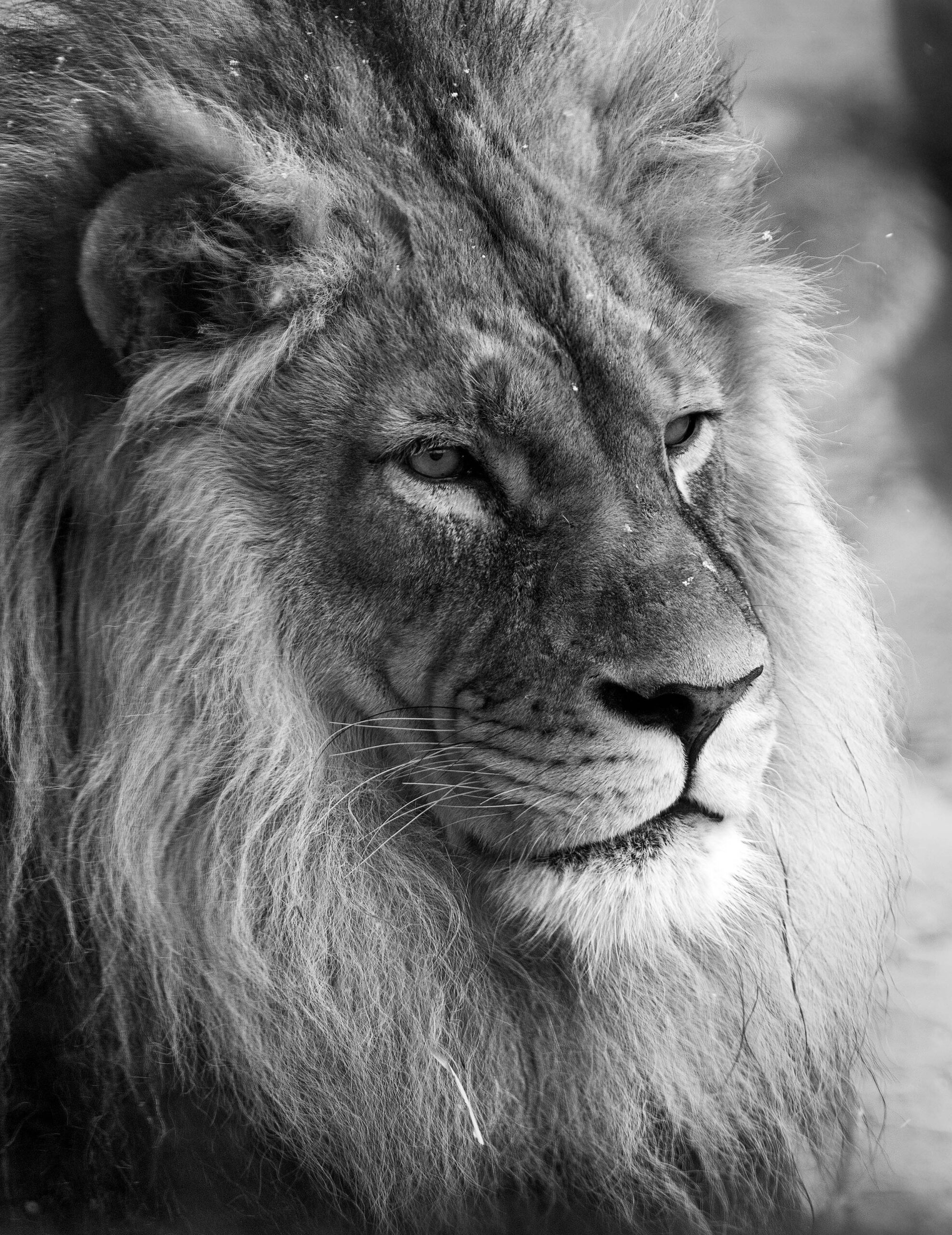
The black-and-white edit takes a different set of features into view. Each hair, whisker, and facial feature become more prominent when disregarding color. While still present in the color version, the color distracts the viewer from immediately noticing it and thus becomes more hidden. The black and white also creates a more nostalgic look to the image, as if it were from 50 years ago.

